Informational Boxes
Information in a box
When you want to present information to the user in a form of a dialog box, you'll want to use this feature that presents you with a wide variety of informational box styles to choose from, depending on the purpose. Some informational box styles are modal, while others are non-modal. Modal informational boxes require input from the end user, while non-modal informational boxes don't require input and usually represent a progress being made.
The following informational box styles are presented in this way:
Modal informational boxes
Buttons
Input
Input (password)
Input (character)
Multi-input (using input modules)
Modal dialog box
Slider
Selection
Multi selection
Non-modal informational boxes
Non-modal dialog box
Progress
You can configure the infoboxes and how they appear and/or behave using the InfoBoxSettings class. You can access the global settings using the GlobalSettings property. This class contains the following properties:
Title: A short title to describe the infoboxBorderSettings: Controls how the borders are renderedForegroundColor: Foreground color of the infobox (including border, title, and content)BackgroundColor: Background color of the infoboxUseColors: Whether to use the colors or not (default istrue)RadioButtons: Whether to use the radio buttons or not (for single-choice selection infoboxes)Positioning: Determines the positioning of the infoboxUsePopover: Uses the popover for multi-input selection infoboxes (input modules should handle popovers)
Until Terminaux 7.0, you can still use the argument-based overloads when making a new infobox. Those overloads, however, are deprecated and you should use the InfoBoxSettings instance instead.
You can use SetForegroundColor() and SetBackgroundColor() functions to reset the colors to a color determined by the theme and updated accordingly by passing null to those functions.
All informational boxes, modal or non-modal, utilizes the InfoBox class to specify how to write the informational box to the console, such as positioning, text, and settings. If you want to create a custom infobox not covered in any of the below pre-defined infobox styles, you'll have to refer to their source code and create the style handler yourself.
Modal informational boxes
Informational box styles of this nature are modal. They require input from the end user in order to present information to the user with action. These boxes are common in interactive console applications where information is to be conveyed to the user. They are presented in a different style, based on how or what action the user needs to take, and their borders are customizable with the BorderSettings instance.
Every single modal informational box style contain their own help page which you can access via the K key. They support both keyboard and mouse.
For informational boxes that use choice-based input styles, you can discover how to define choices by visiting this page:
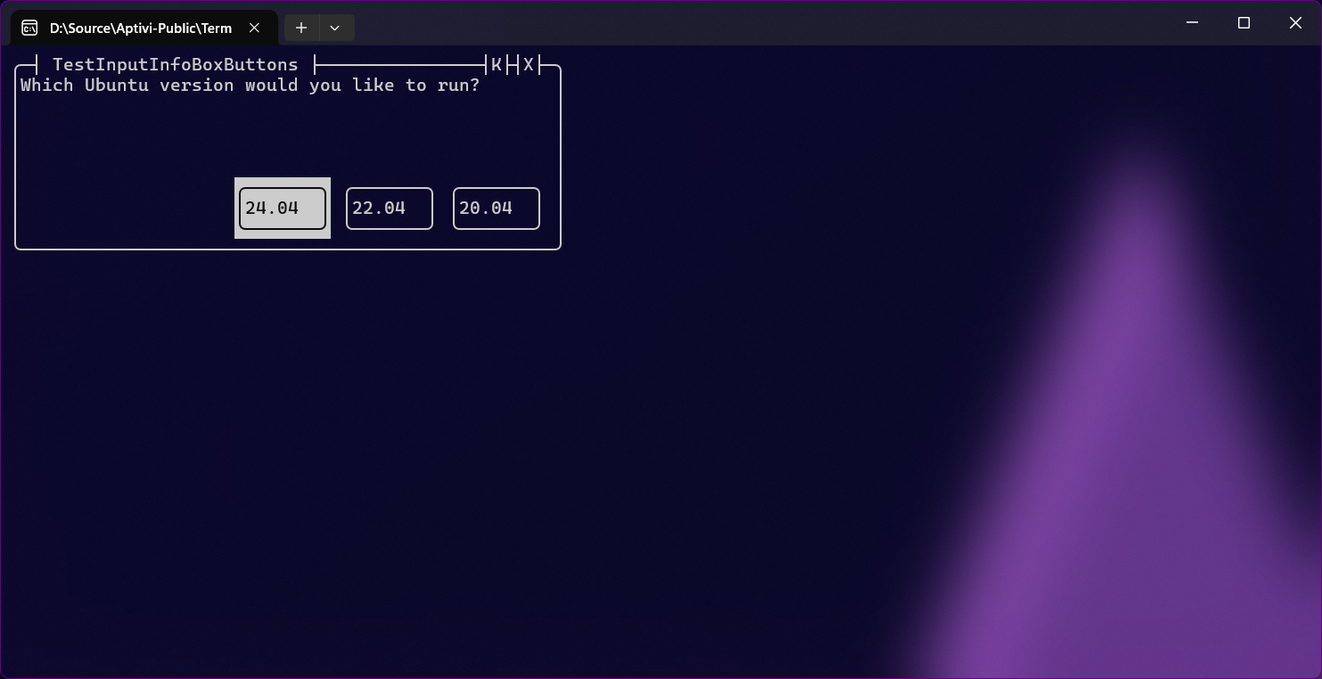
Choice-based inputsButtons
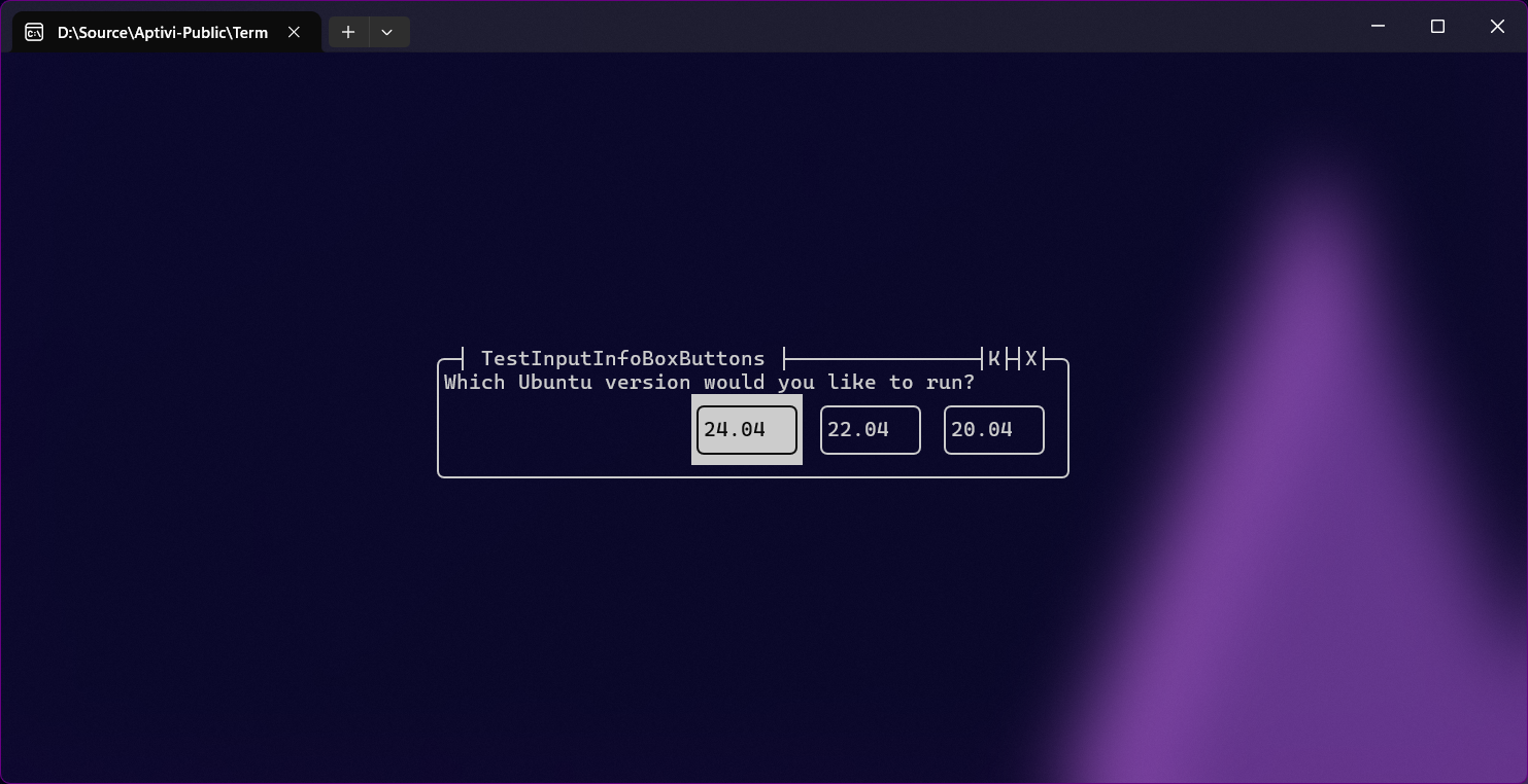
This style utilizes choice-based input to render the buttons inside the informational box of this style, which makes them look like a conventional dialog box. This style can render up to three buttons from the right to the left, which means three instances of InputChoiceInfo. You can use this style with the InfoBoxButtonsColor class.
Input

This style uses the input reader to tell the user to write something, based on the informational box contents. For example, if this informational box tells an end-user to write a hostname of an SFTP server, the user will have to write the hostname. You can use this style with InfoBoxInputColor.
Input (password)
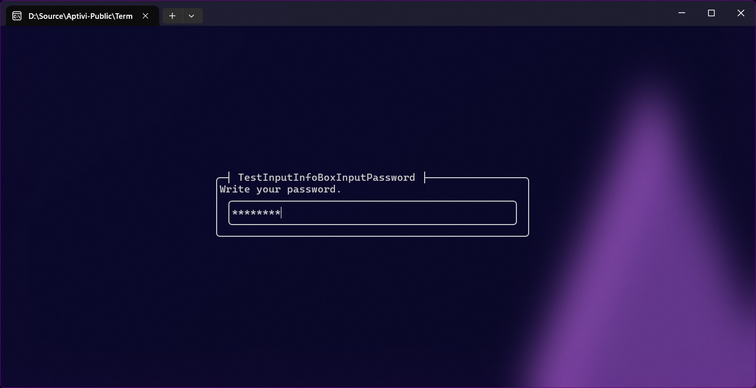
This style uses the input reader masked with the password to tell the user to write something, based on the informational box contents. For example, if this informational box tells an end-user to write a password of an account when logging in to the SFTP server, the user will have to write the password. You can use this style with InfoBoxInputColor with specifying the InfoBoxInputType as Password.
Input (character)
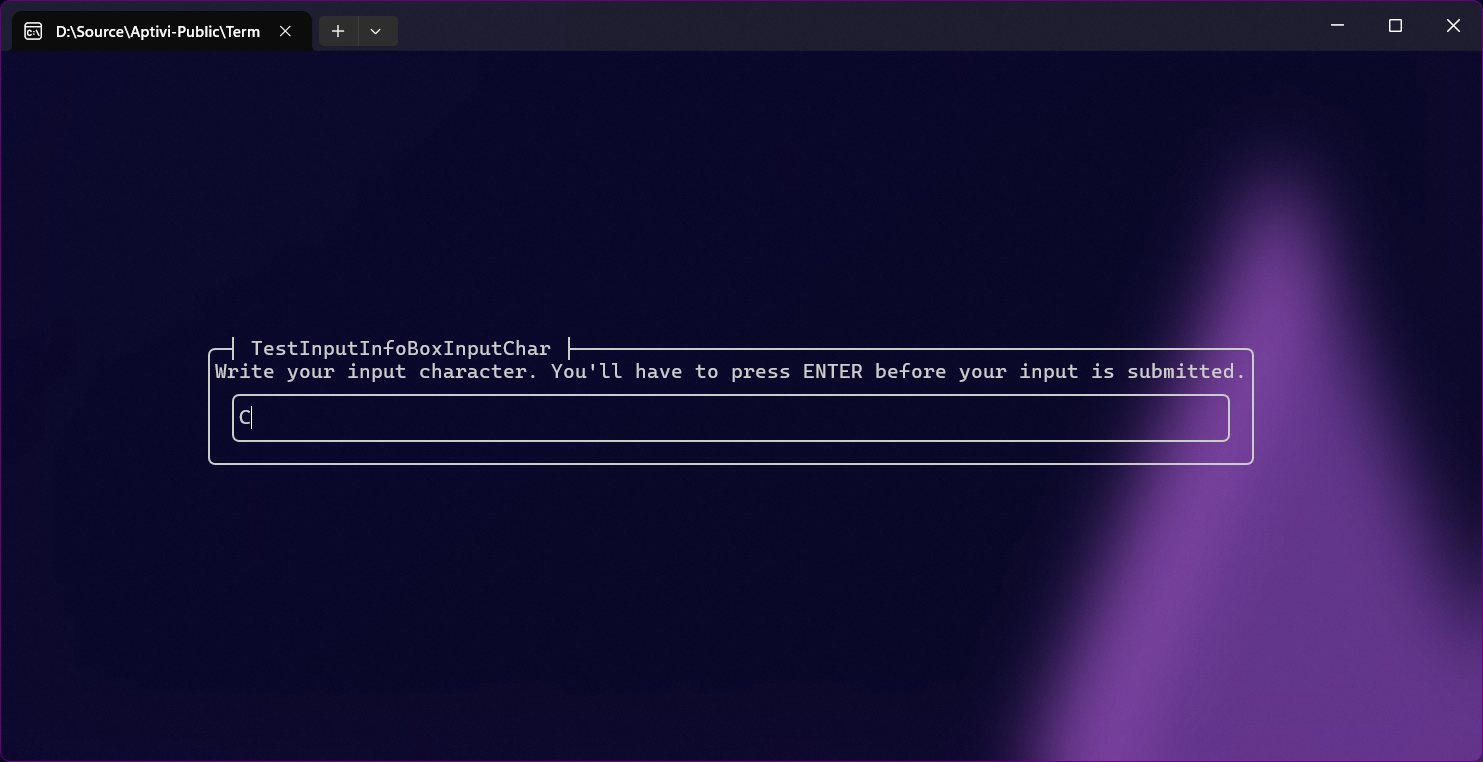
This style uses the input reader that takes the first character from the input string, based on the informational box contents. For example, if this informational box tells an end-user to write a character to specify a box border character, the user will have to write it. You can use this style with InfoBoxInputColor with specifying the InfoBoxInputType as Character.
Multi-input
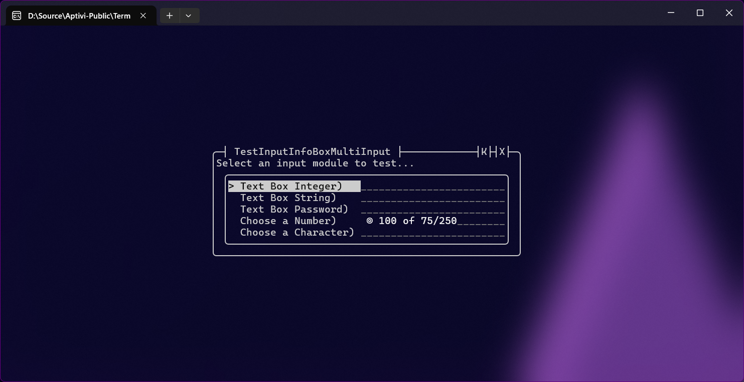
This style uses the input modules to describe multiple ways to present input to the user using different modules, such as having a text box and a combo box at the same time. You can use this style with InfoBoxMultiInputColor.
To learn more about input modules, consult the page below:
Normal modal info box
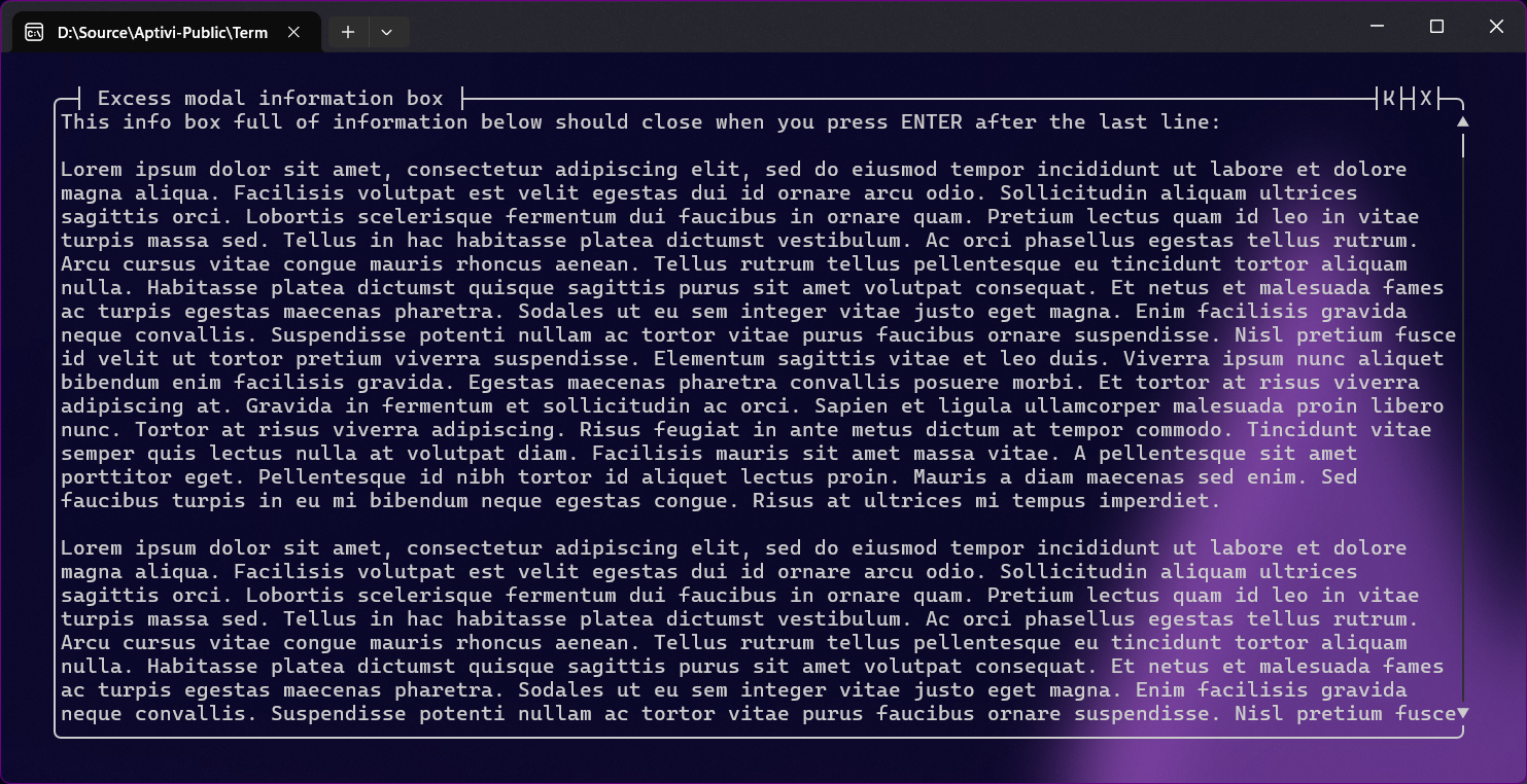
This style only prints information that the end user needs to read. This is suitable for information that doesn't need any action. You can use this style with the InfoBoxModalColor class.
Slider
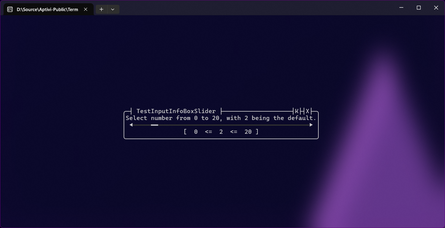
This style allows you to define a minimum, a current, and a maximum value of an integral value that can only be described as surrounded between the minimum value and the maximum value. For example, a slider that has a minimum value of 5 and a maximum value of 10 can only accept values of between 5 and 10, which means 5, 6, 7, 8, 9, and 10. You can use this style with the InfoBoxSliderColor class.
Selection styles
There are two styles in this category:
Single selection
Multiple selection
Single selection informational box
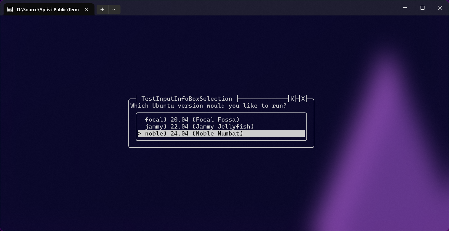
This info box style uses the choice-based input to define choices that the end user will have to select one of them. Plus, you can search for a choice using the F key to initiate a regex-based search for maximum flexibility. You can use this style with the InfoBoxSelectionColor class.
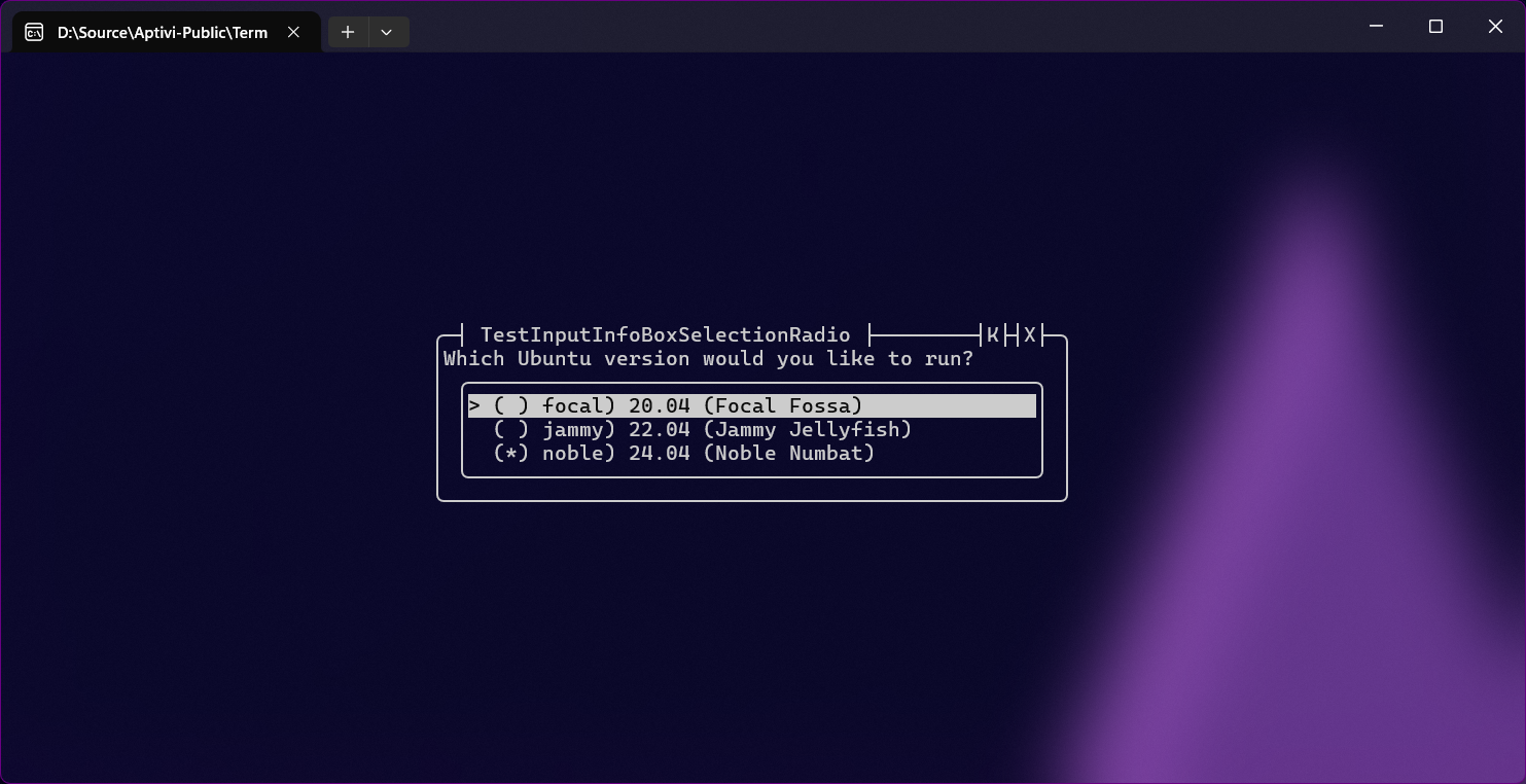
You can additionally enable radio buttons using the RadioButtons property in the infobox settings.
Multiple selection informational box

This info box style uses the choice-based input to define multiple choices that the end user will have to select one of them. Plus, you can search for a choice using the F key to initiate a regex-based search for maximum flexibility. You can use this style with the InfoBoxSelectionMultipleColor class.
Non-modal informational boxes
In addition to the modal informational boxes, we also have non-modal informational boxes that don't wait for user input, but gets rendered once per call.
Normal infobox
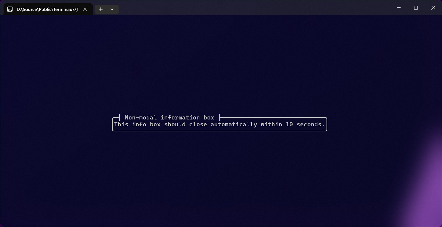
This is used to convey information to the end user that some progress is being made without any percentage. Such progress is called indeterminate progress. However, this can be used to display a disclaimer or any other information within a limited time.
Progress
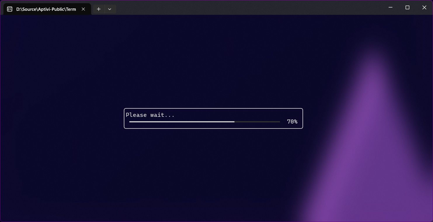
This is used to tell the end user through an informational box with a progress bar that something is happening, and that the progress is being done all the way to 100%. This infobox needs to be in a loop while progress is being made.
Infobox positioning
All informational boxes support positioning, because they expose a writable property called Positioning in the InfoBoxSettings class. It can be configured globally using the GlobalSettings property found in the InfoBoxPositioning class.
The following properties can be used to position the informational box however you want:
Autofit: If turned on, the informational box will be automatically placed in the middle of the screen, growing according to the textual content. If turned off, the informational box will be rendered based on the below positioning values.Left: Zero-based left position of the infoboxTop: Zero-based top position of the infoboxWidth: Width of the infobox (default:50)Height: Height of the infobox (excluding the extra height) (default:5)ExtraHeight: Reserved height for elements that will be placed after the information text (keep zero for text only)
Turning off autofit for infoboxes, while keeping default configuration, will result in this: